Why Are Responsive Web Design Services in Austin Essential for Business Growth?
In today’s digital-first marketplace, your website is often the first interaction a potential customer has with your business. If your website looks great on a desktop but is difficult to use on a smartphone or tablet, you may be losing valuable visitors and potential customers.
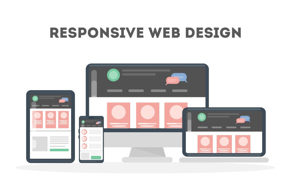
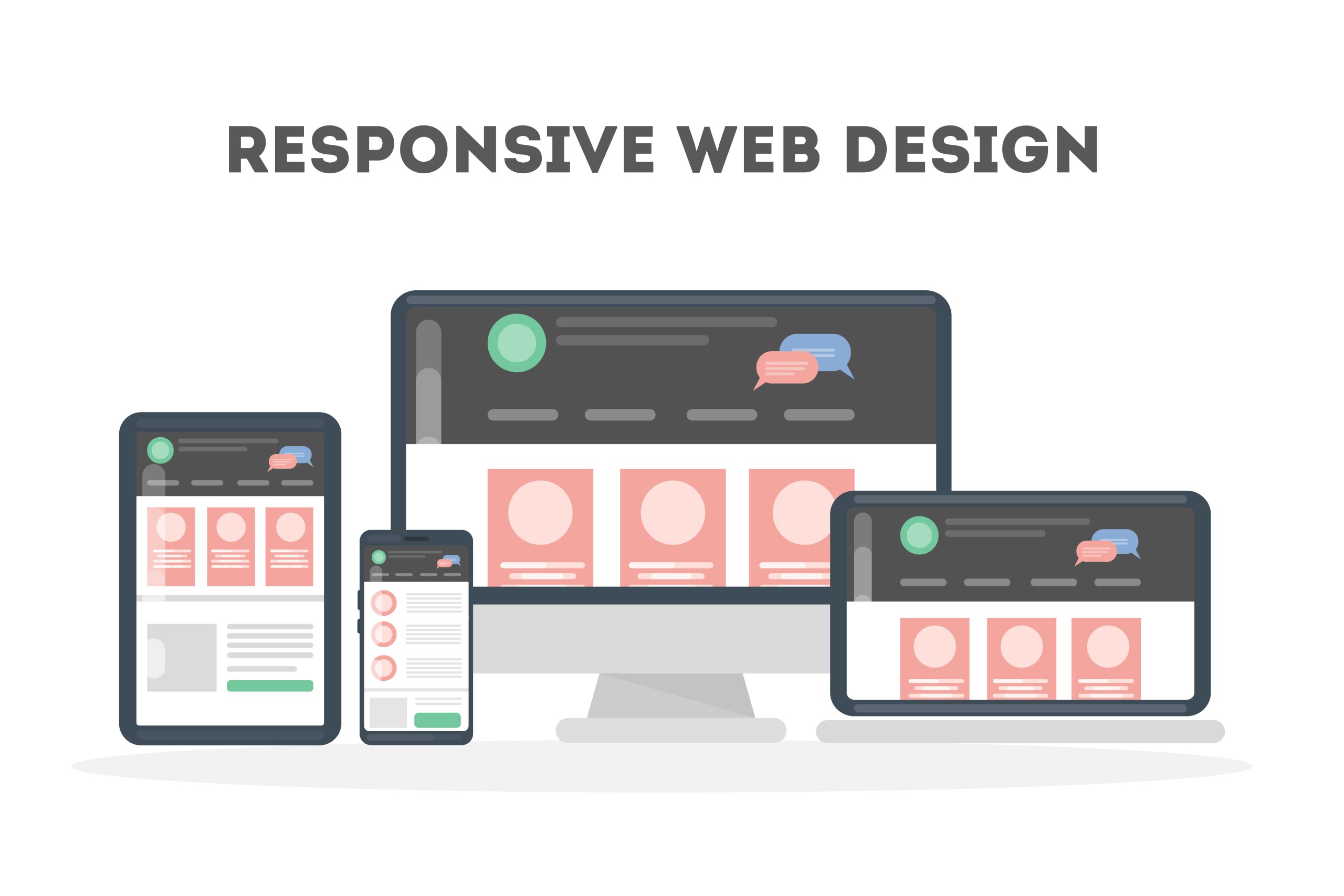
This is why responsive web design services in Austin have become increasingly important for businesses of all sizes. A responsive website automatically adapts its layout, images, navigation, and content to different screen sizes, creating a consistent and user-friendly experience across desktops, laptops, tablets, and smartphones.
For businesses competing in Austin’s growing digital market, responsive design is not simply a visual feature. It can support better user experience, stronger search visibility, improved engagement, and more opportunities to convert visitors into customers.
What Is Responsive Web Design?
Responsive web design is an approach to website development where a website adjusts automatically according to the device and screen size being used.
Instead of creating separate websites for desktop and mobile users, a responsive website uses flexible layouts and design elements that adapt to different devices.
For example, a responsive website can:
Adjust page layouts for smartphones and tablets
Resize images automatically
Make buttons easier to tap on smaller screens
Improve mobile navigation
Prevent horizontal scrolling
Keep text readable across different screen sizes
Provide a consistent brand experience
This makes responsive design an important part of modern web design services in Austin.
Why Do Austin Businesses Need Responsive Websites?
Austin has a competitive business environment, and customers increasingly use mobile devices to research companies, compare services, read reviews, and make purchasing decisions.
A website that provides a poor mobile experience can make visitors leave before they understand what your business offers.
A responsive website helps businesses provide a smoother digital experience regardless of how customers access the site.
1. Better User Experience
A website should be easy to navigate whether someone visits it from a desktop computer or smartphone.
Responsive design helps visitors find information, read content, view images, complete forms, and contact your business without constantly zooming or resizing the screen.
A better user experience can encourage visitors to spend more time exploring your website.
2. Mobile-Friendly Website Experience
Mobile users expect websites to load and function properly on smaller screens.
Responsive web design ensures that important elements such as menus, buttons, images, contact forms, and service information remain usable on mobile devices.
For local businesses, this can be particularly valuable because customers may search for services while they are away from their computers.
3. SEO-Friendly Website Structure
Responsive design can also support an effective SEO strategy.
A technically sound website can make it easier for search engines to crawl and understand its pages. Mobile usability, page performance, site structure, relevant content, and other technical factors all contribute to creating a stronger foundation for organic search visibility.
For businesses targeting searches such as:
Responsive Web Design Services in Austin
Web Design Company in Austin
Austin Web Design Services
Responsive Website Design Austin TX
Custom Web Design Austin
Mobile-Friendly Website Design Austin
SEO-Friendly Web Design Austin
having a well-structured website is essential.
4. Consistent Brand Presentation
Your website represents your business online.
If your branding appears professional on desktop but becomes disorganized on mobile, customers may question the quality of your business.
Responsive design helps maintain consistency in:
Colors
Typography
Images
Logos
Navigation
Content structure
Calls to action
This creates a more professional experience across devices.
5. Easier Website Management
With responsive design, businesses generally don’t need to maintain separate desktop and mobile versions of the same website.
This can simplify content updates and website maintenance.
When you update a page, image, service description, or blog post, the responsive layout can display that information appropriately across supported screen sizes.
What Should You Look for in Responsive Web Design Services in Austin?
Choosing the right web design partner involves more than selecting a company that can create an attractive homepage.
Look for a provider that understands design, technology, usability, performance, and business objectives.
Important considerations include:
Mobile-First Thinking
A professional web design team should consider mobile users from the beginning rather than treating mobile optimization as an afterthought.
Custom Design
Your website should represent your business rather than looking identical to hundreds of other websites.
Custom design can help communicate your brand personality, services, products, and unique value proposition.
SEO-Friendly Architecture
A website should be developed with SEO considerations from the beginning, including logical navigation, optimized page structure, headings, metadata, internal links, and crawl-friendly architecture.
Fast Performance
Visitors expect websites to load quickly. Unnecessary scripts, oversized images, poor hosting configurations, and inefficient code can negatively affect website performance.
Clear Calls to Action
A responsive website should make it easy for visitors to take the next step.
Depending on the business, calls to action may include:
Contact Us
Request a Quote
Schedule a Consultation
Call Now
Buy Now
Get Started
Book an Appointment
Cross-Device Testing
A website should be tested across different screen sizes and browsers to identify layout, navigation, performance, and usability issues before launch.
Responsive Web Design vs. Traditional Web Design
Traditional fixed-width websites were primarily designed around desktop screen sizes. When viewed on smaller screens, users may need to zoom, scroll horizontally, or struggle with navigation.
Responsive websites are designed to adapt.
Feature
Traditional Fixed Design
Responsive Web Design
Mobile Experience
Often limited
Optimized
Screen Adaptation
Limited
Automatic
Navigation
May be difficult on mobile
Designed for usability
Images
Fixed or limited
Flexible
Maintenance
Can be complicated
Generally simpler
User Experience
Device-dependent
Consistent
Modern SEO Strategy
May require improvements
Stronger foundation
For businesses that want a modern digital presence, responsive design is the more flexible approach.
How Siri IT Approaches Web Design
Siri IT Solutions provides web design and development services for businesses and maintains a presence in Austin, Texas. Its listed services include website development, web designing, UI/UX web designing, SEO and content writing, and digital marketing.
The company also describes its web solutions as supporting desktop, mobile, and tablet experiences, alongside services such as e-commerce, CMS, and web application development.
For businesses considering a website project, a responsive approach can help combine visual design with usability and technical performance.
What Is the Process for Creating a Responsive Website?
A professional responsive website project typically follows several stages.
Step 1: Business Research
The first stage involves understanding the business, target audience, competitors, services, and website objectives.
Step 2: Website Planning
The structure of the website is planned, including pages, navigation, content hierarchy, and conversion paths.
Step 3: UI/UX Design
Designers create layouts that make the website visually appealing and easy to navigate.
Step 4: Responsive Development
The approved design is converted into a functional website that adapts to different screen sizes.
Step 5: SEO Implementation
Important SEO elements such as headings, metadata, URLs, internal links, image optimization, structured data where appropriate, and technical foundations can be incorporated.
Step 6: Testing
The website is tested across different devices, browsers, screen sizes, forms, menus, and interactive elements.
Step 7: Launch and Maintenance
After final testing, the website can be launched and monitored. Regular maintenance helps keep content, security, functionality, and performance up to date.
Siri IT describes its broader process around research, evaluating plans, and delivering results, while its website services include website development, UI/UX design, SEO/content, and digital marketing.
Final Thoughts
A website needs to do more than look attractive. It should provide a smooth experience, communicate your brand clearly, support search visibility, and make it easy for customers to take action.
For businesses looking for responsive web design services in Austin, investing in a mobile-friendly, SEO-conscious, user-focused website can provide a strong foundation for long-term digital growth.
Siri IT Solutions offers web designing, UI/UX design, website development, SEO/content, and other digital services, with an Austin office listed on its website.
If your existing website is difficult to use on mobile devices, slow, outdated, or no longer aligned with your business goals, a responsive website redesign may be the right next step.