Responsive Web Design in Austin: Why Your Business Needs a Mobile-Friendly Website
In today’s digital world, people access websites from a variety of devices, including smartphones, tablets, laptops, and desktop computers. If your website does not adapt properly to different screen sizes, visitors may struggle to navigate it. Responsive web design ensures that your website automatically adjusts its layout, images, and content to provide a smooth user experience on any device. For businesses in Austin, having a responsive website is essential to attract customers, improve search engine rankings, and stay competitive in the growing digital market.
What is Responsive Web Design?
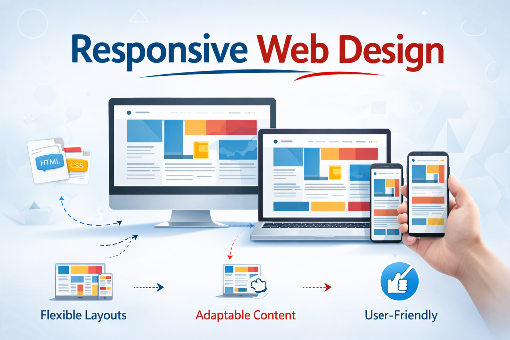
Responsive web design is a web development approach that allows a website to automatically adapt to different screen sizes and devices. Instead of creating separate versions of a website for mobile and desktop users, responsive design uses flexible layouts, images, and CSS media queries to adjust the design dynamically.
This means that whether a customer visits your website from a smartphone, tablet, or desktop computer, the site will display correctly and remain easy to navigate. Content will resize, images will scale properly, and menus will adjust to provide a seamless browsing experience.
Why Responsive Web Design is Important for Austin Businesses
Austin is a rapidly growing business hub with a strong technology sector and a competitive digital marketplace. Local customers frequently search online for services, restaurants, stores, and professional solutions. If your website is not mobile-friendly, you may lose potential customers to competitors whose websites are easier to use.
A responsive website improves accessibility, ensuring that visitors can quickly find information about your products or services regardless of the device they are using. It also creates a positive first impression and helps build trust with potential customers.
Improved User Experience
User experience plays a major role in how long visitors stay on your website. If a site requires users to zoom in, scroll horizontally, or struggle with navigation, they are likely to leave quickly.
Responsive web design eliminates these issues by adjusting the layout automatically. Text becomes easier to read, images scale appropriately, and navigation menus become simple to use. A smooth user experience encourages visitors to explore more pages and increases the chances of converting them into customers.
Better Search Engine Rankings
Search engines prioritize mobile-friendly websites. Responsive design helps improve your website’s performance in search engine results because it provides a consistent experience across devices.
When your website loads quickly, displays properly on mobile devices, and offers easy navigation, search engines consider it more valuable to users. This can lead to higher rankings, increased visibility, and more organic traffic from potential customers searching for services in Austin.
Faster Website Loading Speed
Website speed is another important factor for both user experience and search engine optimization. Responsive websites are designed to load efficiently across different devices. Proper image scaling, optimized code, and adaptive layouts help reduce loading times.
Fast loading speeds reduce bounce rates and encourage visitors to stay on your website longer. For businesses in Austin that rely on online leads, a faster website can significantly improve engagement and conversion rates.
Cost-Effective Website Management
In the past, businesses often maintained separate desktop and mobile versions of their websites. This approach required more development time, higher costs, and additional maintenance.
Responsive web design eliminates the need for multiple versions of a website. With a single responsive website, updates and maintenance become easier and more efficient. Businesses can manage their content from one platform while ensuring that it looks great on every device.
Increased Conversion Rates
A well-designed responsive website makes it easier for visitors to take action. Whether the goal is filling out a contact form, making a purchase, booking an appointment, or requesting a quote, responsive design simplifies the process.
Clear navigation, readable content, and mobile-friendly forms improve usability and encourage users to complete desired actions. This leads to higher conversion rates and more business opportunities.
Key Features of Responsive Web Design
Responsive web design includes several important elements that ensure a website functions effectively across devices:
Flexible grid layouts that adjust automatically to screen size Scalable images that maintain quality while adapting to different resolutions Mobile-friendly navigation menus Optimized typography for easy reading Fast loading performance across devices Touch-friendly buttons and interactive elements
These features work together to create a consistent and engaging user experience for visitors.
Choosing the Right Web Design Partner in Austin
If you want to build or upgrade your website, working with an experienced web design team is important. A professional web design agency understands how to create responsive layouts, optimize website performance, and ensure compatibility with modern devices and browsers.
The right partner will focus on user experience, search engine optimization, and performance optimization to help your website attract more visitors and generate better results.
Conclusion
Responsive web design is no longer optional for modern businesses. With more people browsing the internet on mobile devices, having a website that adapts to every screen size is essential for success. For businesses in Austin, a responsive website improves user experience, boosts search engine visibility, increases conversions, and helps maintain a strong online presence.
Investing in responsive web design ensures that your business stays competitive and accessible to customers anytime and from any device. If your current website is not optimized for mobile users, now is the right time to upgrade and provide visitors with a seamless digital experience.